QaqC-tutorial
Welcome to the QaqC Dashboard - your one-stop tool for validating, cleaning, and exploring phenotypic datasets before statistical analysis. This tutorial will walk you through each step of the app with detailed instructions and visual guides.
———————————– Step 1: Upload the Dataset ———————————
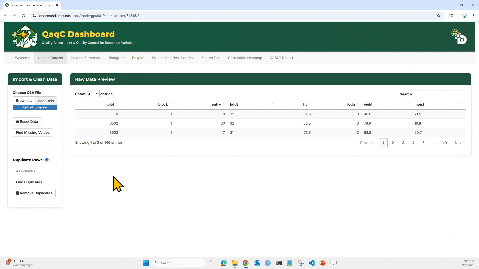
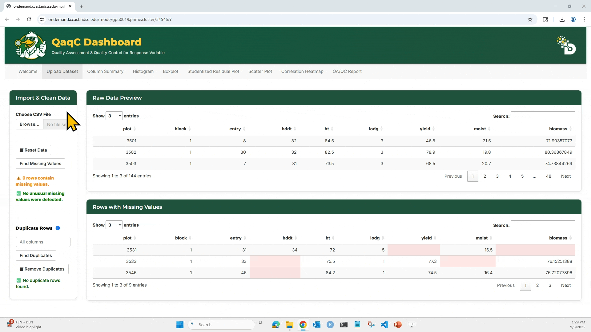
This is where everything starts. You’ll load your phenotypic CSV file into the app, preview the data, and check for basic issues like missing values or duplicates.
📥 Purpose:
- This is where everything starts. You’ll load your phenotypic CSV file into the app, preview the data, and check for basic issues like missing values or duplicates.
🎯 What You Can Do:
- Upload your
.csvfile. - View a Raw Data Preview table.
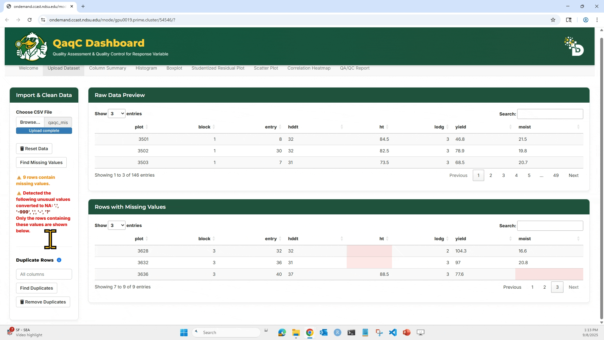
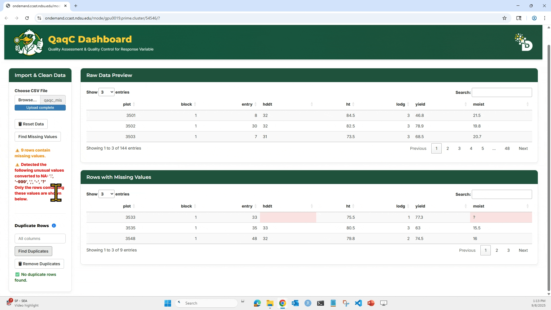
- Detect and remove missing values.
- Detect and remove duplicate rows based on selected columns.
🖱️ How to Use:
1. Click “Browse…” to upload your .csv file. Make sure the file has column headers in the first row.
2. After loading, the dataset preview appears on the right side under Raw Data Preview.
 —
—
3. Click “Find Missing Values” to highlight any missing entries (NA or blank).
4. To check for duplicates: Select which column(s) to check, Click “Find Duplicates”, and You can then choose to Remove Duplicates if needed.
5. Reset Data will clear your current session and allow re-upload.
🧠 Tip:
- All downstream analyses (summary stats, visualizations, model residuals) use the cleaned dataset, so this step is critical for ensuring high-quality input.
———————————– Step 2: Column Summary Tab ———————————–
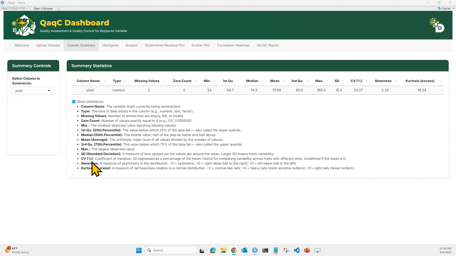
🔍 Purpose: Get descriptive statistics for any numeric column — a fast way to assess data spread, potential outliers, and normality.
🎯 What You Can Do:
- Select any numeric trait from the dropdown.
- View detailed statistics:
- Missing count
- Zero count
- Min, Max
- Quartiles (Q1, Median, Q3)
- Mean, SD, CV%
- Skewness & Kurtosis
🖱️ How to Use:
- Choose a trait/column from the “Select Column to Summarize” dropdown.
- The Summary Statistics table will update instantly.
- Click “Show Definitions” to view explanations of each metric.
📘 Metric Definitions (examples):
- CV (%): Coefficient of Variation. Helps compare variation across traits with different units.
- Skewness: Indicates asymmetry of the distribution.
- Kurtosis: Measures tail heaviness. >0 = heavier tails.
——————————– 🚦 Step 3: Visualize & Detect Outliers ——————————–
This step includes three tabs — Histogram, Boxplot, and Studentized Residual Plot — that help detect and visualize unusual patterns or outlier values.
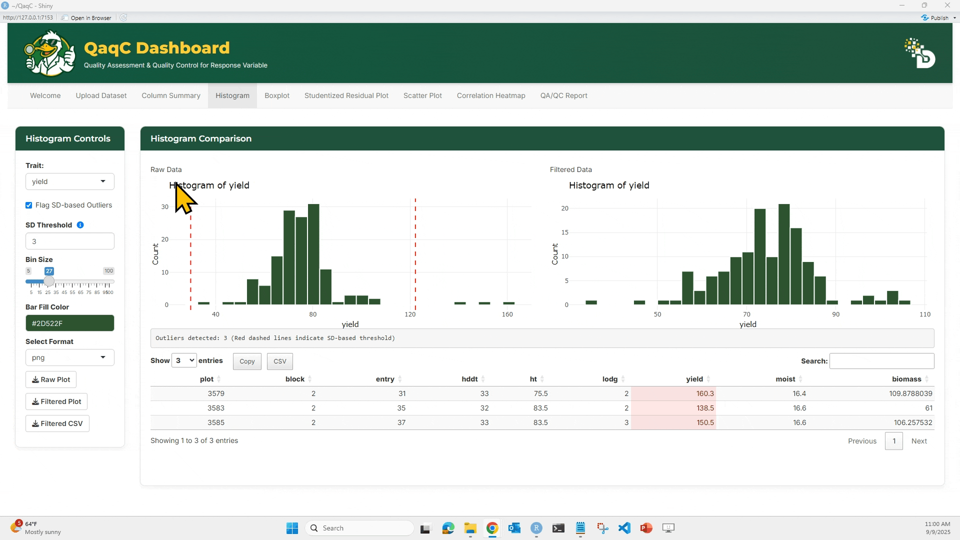
📉 Tab 1: Histogram
🎯 What You Can Do:
- Visualize frequency distribution of a numeric trait.
- Adjust bin size and color.
- Flag outliers using Standard Deviation thresholds.
- Download plots or filtered data.
🖱️ How to Use:
- Select a trait.
- Optionally enable “Flag SD-based Outliers” and set bin size (if needed).
- Compare Raw vs Filtered histograms.
- Filtered histogram excludes flagged outliers.
- Below the plots, see a summary table of outlier rows.
- Use the download buttons to save:
- Raw Plot, Filtered Plot, or Filtered CSV.
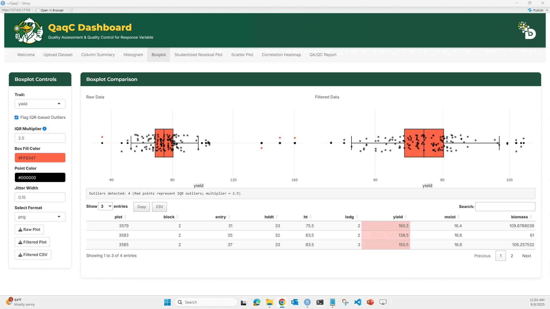
📦 Tab 2: Boxplot
🎯 What You Can Do:
- Identify outliers using IQR-based method.
- Customize box fill and point color.
- Adjust jitter for dot spacing.
🖱️ How to Use:
- Select a trait.
- Optionally enable “Flag IQR-based Outliers”.
- Compare Raw vs Filtered boxplots.
- Below the plots, see a summary table of outlier rows.
- Customize plot aesthetics if desired.
- Download plots and cleaned data.
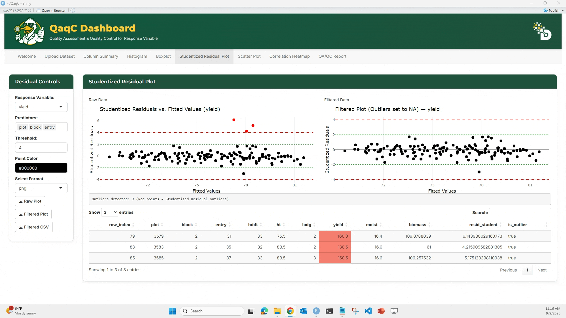
📈 Tab 3: Studentized Residual Plot
🎯 What You Can Do:
- Detect outliers using a linear model.
- Plot studentized residuals against fitted values.
- Flag residuals exceeding ±4 threshold.
- View and export a table of detected outliers.
🖱️ How to Use:
- Choose a Response Variable (e.g., yield).
- Select Predictors (e.g., plot, block, entry).
- Set a threshold (default = 4).
- View the Raw vs Filtered studentized residual plots.
- Red dots = outliers
- Below the plots, see a summary table of outlier rows.
- Export plot or cleaned dataset.
——————————– Step 4: Pairwise & Overall Relationships ——————————–
Once individual traits are cleaned, the next step is to explore relationships between traits. This is crucial for detecting hidden correlations, multicollinearity, or unexpected trends.
We use two tabs here: Scatter Plot (pairwise) and Correlation Heatmap (overall).
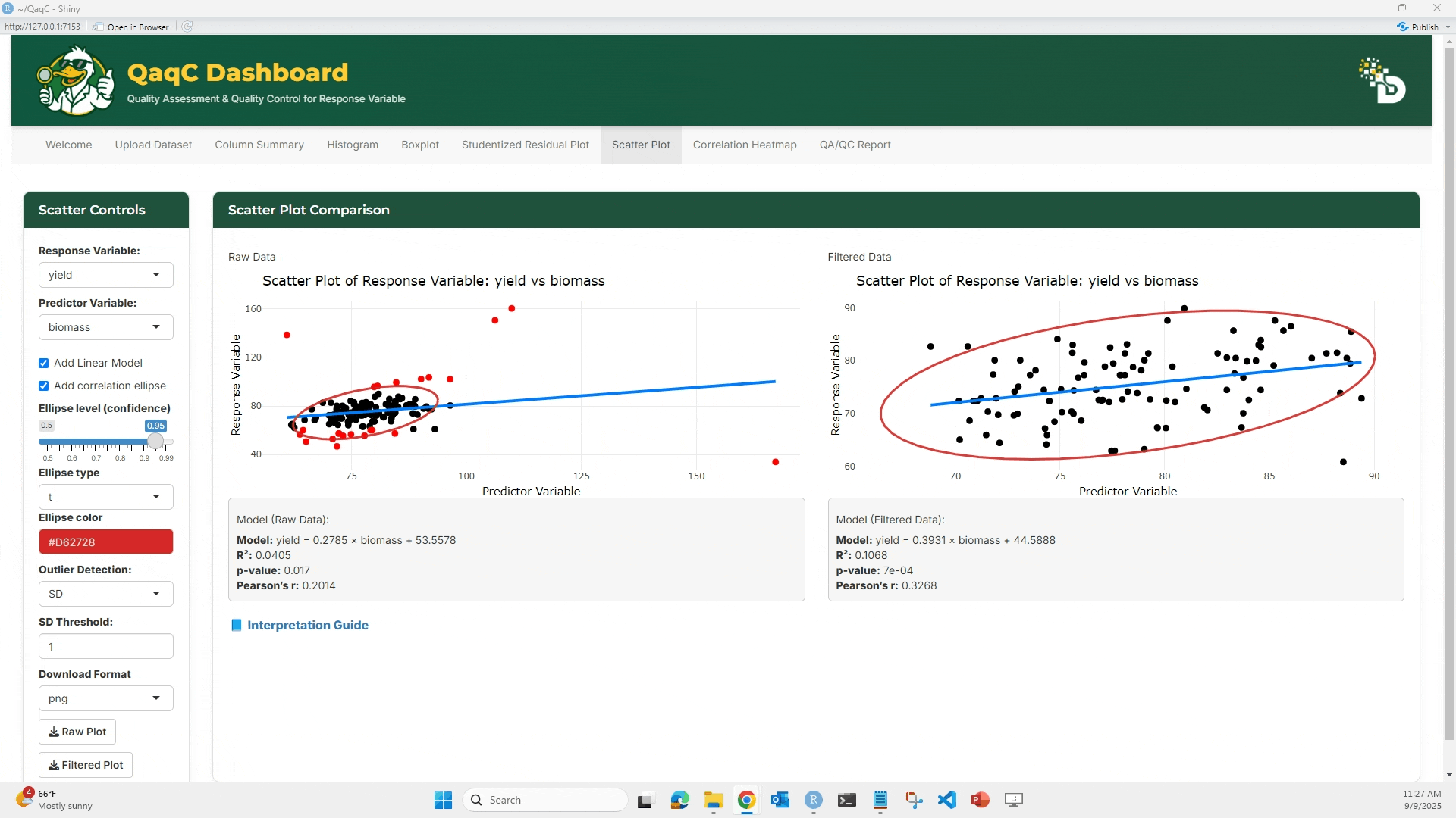
🔹 Tab 1: Scatter Plot
🎯 What You Can Do:
- Plot a response variable against a predictor variable.
- Add a linear regression line or correlation ellipse.
- Flag and filter outliers if needed.
- Display model statistics below the plot:
- Equation of best-fit line
- R² (coefficient of determination)
- p-value (significance of relationship)
- Pearson’s correlation (strength & direction of association)
🖱️ How to Use:
- From the left panel, select a Response Variable (e.g., yield).
- Select a Predictor Variable (e.g., plot).
- (Optional) Check “Add Linear Model” to overlay a regression line.
- (Optional) Add a Correlation Ellipse to visualize spread.
- Compare Raw vs Filtered scatterplots.
- Review model results under each plot.
📘 Interpretation Example:
- If R² = 0.01 → very weak relationship.
- If Pearson’s r = 0.75 → strong positive correlation.
- p-value < 0.05 → relationship is statistically significant.
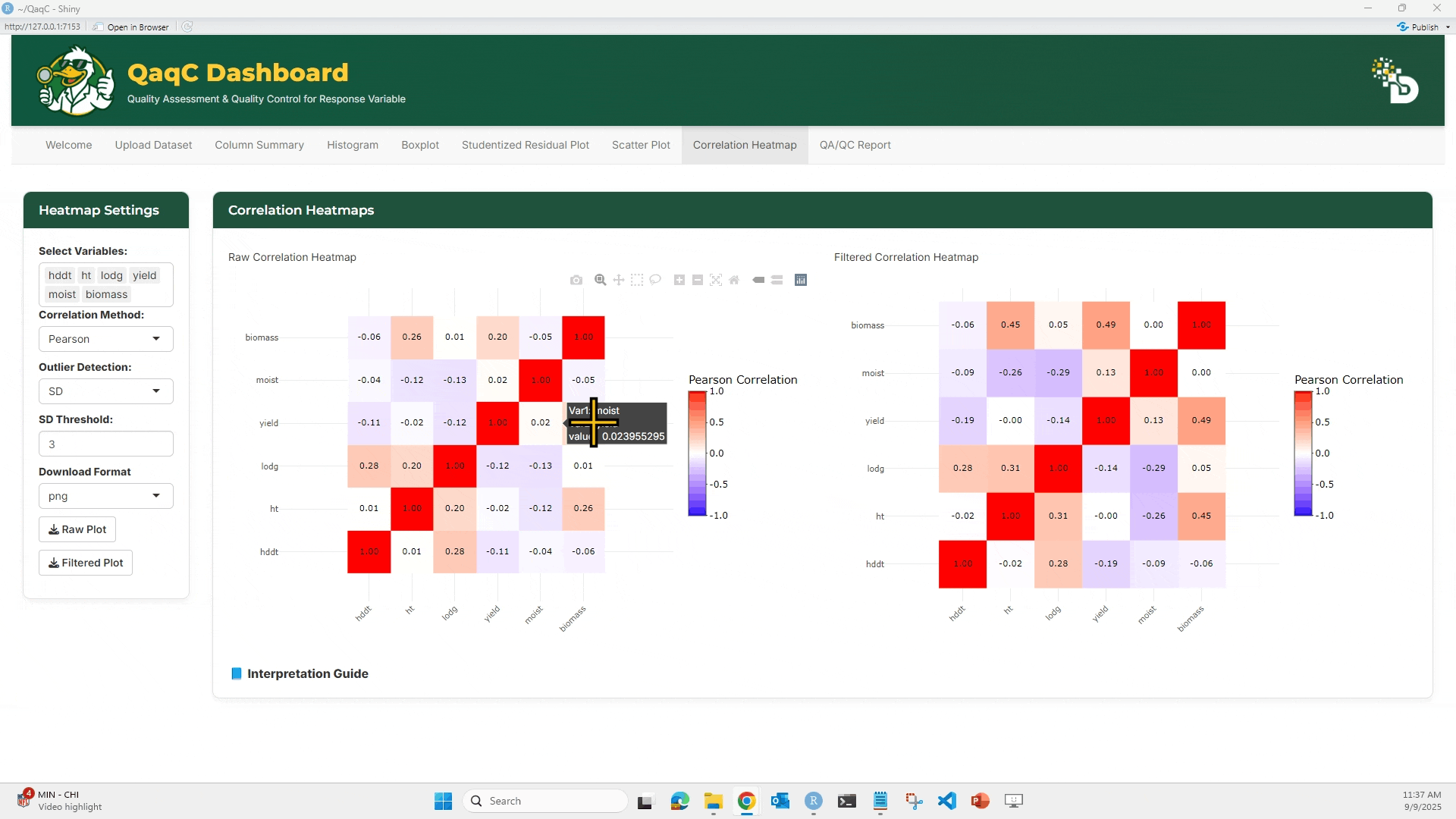
🔹 Tab 2: Correlation Heatmap
🎯 What You Can Do:
- View overall pairwise correlation between multiple traits.
- Choose correlation method (Pearson, Spearman, Kendall).
- Apply outlier filtering (e.g., SD-based).
- Compare Raw vs Filtered heatmaps.
- Export plots and datasets.
🖱️ How to Use:
- Select multiple variables in the Select Variables panel.
- Choose a correlation method:
- Pearson: linear correlations
- Spearman: rank-based correlations
- Kendall: concordance between ranks
- (Optional) Enable outlier detection with SD threshold.
- Compare Raw vs Filtered heatmaps.
- Hover over heatmap cells to see exact correlation values.
- Download as plot or filtered dataset.
📘 Interpretation Example:
- Correlation values range from -1 (perfect negative) to +1 (perfect positive).
- Strong correlations (e.g., >0.7 or < -0.7) may indicate redundancy.
- Negative correlations could point to trade-offs (e.g., yield vs lodging).
——————————📑 Step 5: QA/QC Report ——————————
This is the final step — it brings everything together into a downloadable report.
🎯 What You Can Do:
- Mirror results from selected tabs (Column Summary, Histogram, Boxplot, Residuals, Scatter, Correlation).
- Automatically generate a comprehensive report.
- Download in HTML format for interactivity, sharing or archiving.
🖱️ How to Use:
- In the Mirror Settings panel, check which sections you want to include.
- Example: Histogram + Boxplot + Residuals.
- The report preview updates live under Everything currently visible across tabs.
- Click
Download HTMLto export the full report.
📘 Why It Matters:
- Provides a transparent record of your QA/QC workflow.
- Ensures consistency — same steps can be shared across collaborators.
- Saves time by documenting analyses automatically.
—————————— 🎉 Wrapping Up ——————————
Congratulations — you’ve just completed the QaqC Dashboard tutorial! 🚀
By now, you should be able to:
- Upload and clean phenotypic datasets.
- Summarize traits with descriptive statistics.
- Detect and filter outliers using multiple methods (Histogram, Boxplot, Studentized Residuals).
- Explore pairwise and overall trait relationships (Scatter Plots and Correlation Heatmaps).
- Generate a QA/QC Report to document your workflow and share with collaborators.
💡 Why This Matters
Every cleaned dataset you generate through QaqC is more:
- Reliable — errors and anomalies are caught early.
- Reproducible — every step is documented transparently.
- Decision-ready — enabling confident downstream analysis and interpretation.
🚀 Next Steps
- Use your cleaned dataset in statistical models, GWAS, or genomic prediction.
- Share your QA/QC report with your advisor, labmates, or collaborators.
- Explore how different outlier detection methods change your results.
——————————📬 Support & Contact ——————————
If you run into issues while using the QaqC Dashboard, please don’t hesitate to reach out. We’re here to help!
Gurminder Singh (Developer / Tutorial Author) 📧 g.singh@ndsu.edu
Richard Horsley (Department Head, Project Lead) 📧 richard.horsley@ndsu.edu
Ana Heilman-Morales (Director, NDSU Agricultural Data Analytics, Project Lead) 📧 ana.heilman.morales@ndsu.edu
NDSU Big Data Team (Technical Support) 📧 ndsu.bigdata@ndsu.edu
💡 Tip: When emailing, please include a brief description of the problem and, if possible, a screenshot of the error or the dataset structure you are working with. This helps us respond more effectively.